Using R for Immediate Reporting in Evaluation

I am pretty fortunate that one of the companies I work for is incredibly interested in shifting the organization towards R. One of those shifts was my boss asking, “Can we recreate this report in R? Can we create the report so that it can be automated back to the client immediately after asession?”
The answer to both of those questions is a resounding: YES!
I’m going to walk you through some of the steps that I used to get to this point. This won’t serve as an R tutorial but rather show you the conceptual process that could get you to a beautiful, automated report in R. You can see all the code here on my GitHub page.
1. Create the analysis template
I like to call this the “All But Data (ABD)” draft or template. It’s me imagining what the report will look like once I get all the data in. Fortunately, when you collect data with Qualtrics or Survey Gizmo (and probably others that I have never worked with), you can ask for “test data.” This is perfect for figuring out how to wrangle the data into the shape you need so you can get the output you want.
Load the data into R, clean it up as necessary, and then start analyzing it as if it were the real data. How would you want to report it to your client? What do they need to know? How are you going to visualize the results?
First, I need to set the YAML (Yet Another Markup Language) at the beginning of the document to write out my title, authorship, and describe what output I want my file to be in. I am using the Radix package, described in more detail below, so my YAML looks something like this:
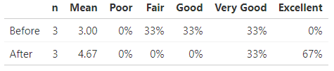
---title: "Sample Immediate Feedback Report"description: |This is super easy to create and edit!author:- name: Dana Wanzeraffiliation: Dana Wanzer Consultingurl: http://danawanzer.comdate: October 29, 2018output:md_document:radix::radix_article:css: Blog_Template_Style.csstoc: yesalways_allow_html: yes---Now, the first thing I want to do in the report is just present the frequency table of responses for two items asking participants to rate their knowledge or skills before and after the webinar.
First, though, I need to load my packages and import my data:
```{r inclue = FALSE, echo = FALSE, warning = FALSE, message = FALSE}knitr::opts_chunk$set(echo = FALSE, warning=FALSE, message=FALSE)#Load packageslibrary(tidyverse)library(knitr)library(kableExtra)library(scales)library(apa)library(janitor)#Read in data from Survey Gizmo or Qualtrics Heredat <- read.csv("Blog_Template_Data.csv")#Remove the junk columns I don't needdat <- dat %>%select(-c(2:21))```Next, I create my table of frequencies, n, and M:
levels = c("Poor","Fair","Good","Very Good","Excellent")#Note the really horrible names coming from Survey Gizmo. I use the 'rename' function to fix these.dat_PL <- dat %>%select(Before.the.webinar..I.would.rate.my.knowledge.or.skills.as..Rate.your.knowledge.or.skills.BEFORE.and.AFTER.the.webinar.Â.,Now.after.the.webinar..I.would.rate.my.knowledge.or.skills.as..Rate.your.knowledge.or.skills.BEFORE.and.AFTER.the.webinar.Â.) %>%rename(Before = Before.the.webinar..I.would.rate.my.knowledge.or.skills.as..Rate.your.knowledge.or.skills.BEFORE.and.AFTER.the.webinar.Â.,After = Now.after.the.webinar..I.would.rate.my.knowledge.or.skills.as..Rate.your.knowledge.or.skills.BEFORE.and.AFTER.the.webinar.Â.) %>%mutate_all(factor, levels = levels)dat_PL_nmean <- dat_PL %>%mutate_all(funs(as.numeric(.))) %>%gather(Variable, value) %>%group_by(Variable) %>%filter(!is.na(value)) %>%summarise(n = n(),Mean = round(mean(as.numeric(value), na.rm = TRUE),2))dat_PL_freq <- dat_PL %>%gather(Variable, value) %>%filter(!is.na(value)) %>%tabyl(Variable, value) %>%adorn_percentages("row") %>%adorn_pct_formatting(digits = 0) %>%as.data.frame()dat_PL_table <- list(dat_PL_nmean, dat_PL_freq) %>%reduce(full_join, by = "Variable") %>%arrange(Mean)kable(dat_PL_table,col.names = c("", "n", "Mean", levels),align = c('l', rep('r', times = 7))) %>%kable_styling(full_width = TRUE,position = "left")Because I couldn't do it all in one table, I need to join these two tables together and use `kable` to make it “pretty:”
dat_PL_table <- list(dat_PL_nmean, dat_PL_freq) %>%reduce(full_join, by = "Variable") %>%arrange(Mean)kable(dat_PL_table,col.names = c("", "n", "Mean", levels),align = c('l', rep('r', times = 7))) %>%kable_styling(full_width = TRUE,position = "left")
And voila, the table in all it’s glory! The code is created that regardless the responses, the table will work. This was important because I would be handing off this template to someone else who is novice in working with R at this point.
2. Customize the design
Unfortunately, a lot of the templates in R for knitting to a PDF, Word document, or HTML page are pretty ugly. This is perhaps my weakest point R so far, but two of my friends (William Carcamo and David Keyes) pointed me into some good directions.
First, the Radix package was a good stepping stone to getting a beautiful article. To see an example, the website for the Radix package is actually built with the Radix package. This is a great solution for knitting to HTML. As a side note, I much prefer knitting to HTML. Knitting to PDF requires LaTeX and it just likes to do all sorts of funky things. It’s much simpler to knit to HTML, but at the cost of making sure you client knows what to do with it if you just send them the HTML file. However, you could always just host the HTML file on your website and send them a link to the report instead!
However, I wanted to customize the colors at minimum. This required flexing my CSS skills! All I had to do was create a .css file and point Radix to that .css file. To simplify matters, I copied the style.css file from the Radix package into my project library and edited that. There are still some things that doesn’t like editing, like the format of the title (it just adopts the h1 formatting), and I have yet to figure out how to embed my company logo where I want it (directly after the authors) but it’s essentially where I want it!
body {background: white;color: black;}h1 {background: white;color: #990000;font-size: 40px;}h2 {background: white;color: #990000;font-size: 14px;}h3 {background: white;color: black;font-size: 14px;}.d-toc {color: #990000;font-size: 0.8em;line-height: 1em;}a:hover {color: #990000;}Want to see what the finished report looks like? Check it out here!
3. Collect data and report!
Now that you have your template ready to go, these are the last steps needed to finalize the report and send to the client:
- Download the data.
- Import the data into R.[1]
- Add any additional interpretations to the report as needed (e.g., maybe there was no significant pre-post change and you need to highlight that to the client).
- Knit the document into whatever output you’d made your template for.
- Send to the client.
- Give yourself a pat on the back!
As you can see, it was creating the template that took the most time and effort. This last step is the easy step. Plug in your data and out pops your report! The only thing that would take time is Step 3 if you are planning on adding interpretation to the report. However, in all it took me about 5 hours to create my template and only around 15 minutes to create the report once I got the data (more time would be needed if additional interpretations were necessary).
I love this method mainly because all the work is done up front and then for every session the client has I only need to spend 15 minutes generating the report and sending to them. They can get their data immediately after data collection!
[1] Steps 1 and 2 could be eliminated if you get the API to your survey software and import that into R. Then you can just import your data directly from your survey software in R rather than go to your survey software website, download it, and import into R.